 gpbl
gpblReact DayPicker
DayPicker is a React component for creating date pickers, calendars, and date inputs for web applications.
Documentation
See daypicker.dev for guides, examples and API reference, or read the docs in the repository.
<picture> <source media="(prefers-color-scheme: dark)" srcset="./website/static/img/screenshot-dark.png" /> <source media="(prefers-color-scheme: light)" srcset="./website/static/img/screenshot-light.png" />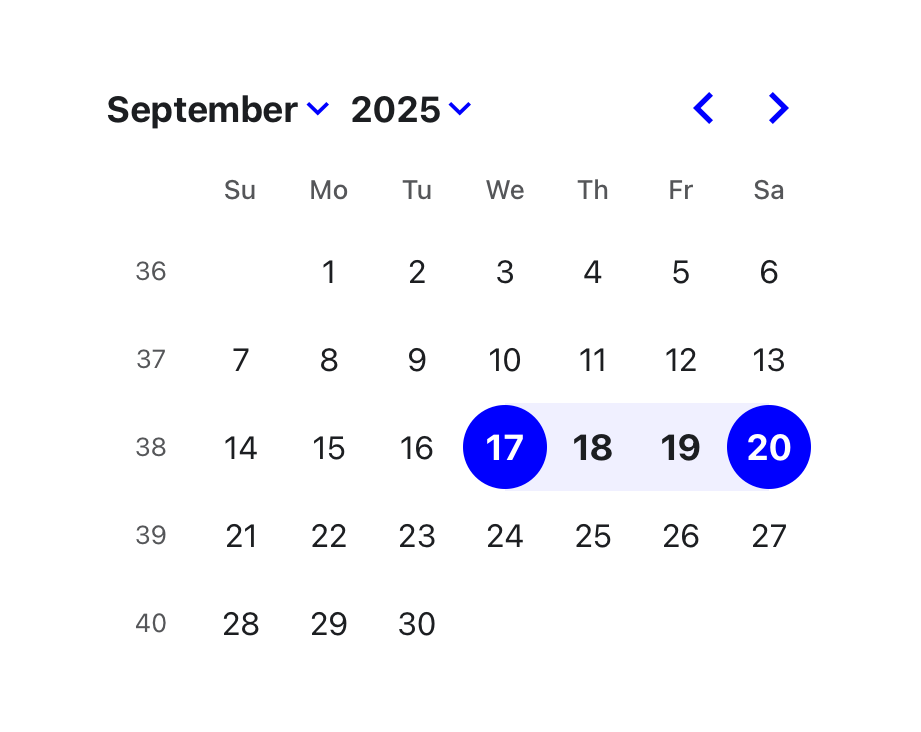 </picture>
Features
- 🛠 Extensive set of props for customizing the calendar.
- 🎨 Minimal design that can be easily styled with CSS or any CSS framework.
- 📅 Supports selections of single days, multiple days, ranges of days, or custom selections.
- 🌍 Can be localized into any language and time zones.
- 🌐 Support for ISO 8601, Persian, and broadcast calendar.
- 🦮 Complies with WCAG 2.1 AA requirements for accessibility.
- ⚙️ Customizable components to extend the rendered elements.
- 🔤 Easy integration with input fields.
DayPicker is written in TypeScript and compiled to CommonJS and ESM. It relies on date-fns for date manipulation and formatting.
Installation
npm install react-day-picker


Example
import { DayPicker } from "react-day-picker";
import "react-day-picker/style.css";

function MyDatePicker() {
  const [selected, setSelected] = useState<Date>();

  return (
    <DayPicker
      mode="single"
      selected={selected}
      onSelect={setSelected}
      footer={
        selected ? `Selected: ${selected.toLocaleDateString()}` : "Pick a day."
      }
    />
  );
}
Compatibility
DayPicker is compatible with React 16.8 and later.
License
DayPicker is released under the MIT License.
Community
Ask for help and share your experience with DayPicker:
- 💬 Discussion forums - Get support and provide feedback.
- 🪳 Report an issue - Report bugs or request features.
Funding
Consider supporting DayPicker's maintainer with a donation. Your support helps keep the project alive and up-to-date.